


Партнерка на США и Канаду по недвижимости, выплаты в крипто
- 30% recurring commission
- Выплаты в USDT
- Вывод каждую неделю
- Комиссия до 5 лет за каждого referral
Mixed
• Most means of production are privately owned
• Government plays an important role in guiding and regulating the economy
• Government regulation prevents workers and consumers from being cheated and abused by business owners
Traditional Economies
Traditional
• Economic decisions are made according to age-old customs (e. g., barter)
• People meet basic needs by hunting, gathering, and farming
• Little technology
Remark
In any economy that is not completely planned, there are markets for some, or all, goods and services. These markets are where everything we study in microeconomics occur. In a pure
free market economy, all goods and services may be bought and sold, whereas in some mixed economies, certain goods may not have normal markets because of government intervention. In either case, however, the way a good is bought and sold depends on its scarcity, who has it, and what they want to do with it.
Discussion activity (in class)
· Describe the main features of each economic system (command, market, and mixed).
· Name nation or group that uses (used) each economic system.
· Why are most modern economies mixed
· Describe given graph, bar-chart and pie-chart.
Additional activity
Describing graphs
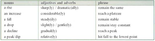
UP-verbs | Go up Increase Take off Rise Shoot up | Grow Soar Improve Jump rocket |
UP-nouns | An increase An uptum A rise A surge | A growth An upsurge An improvement An upward trend |
DOWN-verbs | Go/come down Decline Fall Decrease Fall off | Slip Drop Plummet Slump shrink |
DOWN-nouns | A fall A downturn A decrease | A downward trend A decline A drop |
NO-CHANGE –verbs | Remain stable Remain constant Level off | Stagnate Stay at the same level Stabilise |
AT-THE-TOP-verbs | Reach a peak Peak | Top out |
AT-THE-BOTTOM- verbs | Reach a low point Bottom out | Recover |
DEGREES OF CHANGE | Adjectives Dramatic Considerable Sharp Significant Substantial Moderate slight | Adverbs Dramatically Considerably Sharply Significantly Substantially Moderately Slightly |
SPEED OF CHANGE | Abrupt Sudden Rapid Quick | Steady Gradual Slow |
PREPOSITIONS | A rise from £1 to £2 To fall by 30% | To increase by 50% An increase of 7.5 per cent over last year |
![]()
![]()
![]() at
at
![]()


![]()
 ● from ● ● by
of
● to ● ● ●
 at at
at at
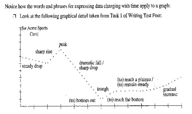
it decreased from 10 to 3 it started at 2 there was a drop of 8
it peaked at 10 it dropped by 8
it finished at 2
When the graph does not show piece of data, use words to express approximation:
under WELL
over WELL | Roughly Nearly Approximately Around About |
When describing charts, the language of comparison is used:
The most popular
The second most popular
 Substantially
Considerably
A lot
Far more common
Much less popular … than
Somewhat
Significantly
Slightly
Fractionally
About twice as common as …
Three times as common as …
Constitutes … %
Writing introductory sentences
Type of chart | Appropriate verb | Description | |
The | Illustration Graph Pie chart Bar chart Table | Shows Illuatrates Presents | The number of… The proportion of… Information on… Data on … |
Graphs serve two purposes. First, when developing economic theories, graphs offer a way to visually express ideas that might be less clear if described with equations or words. Second, when analyzing economic data, graphs provide a way of finding how variables are in fact related in the world.
Numerical information can be expressed graphically in many ways.
Graphs of a single variable
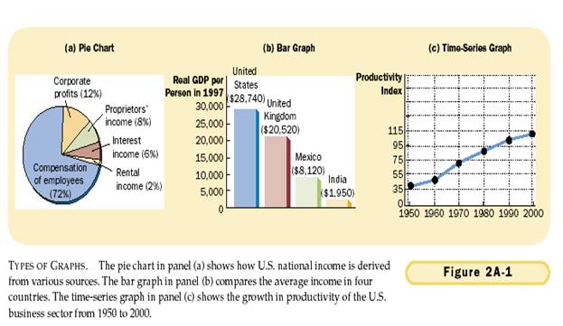
Three common graphs are shown in a figure 1. the pie-chart in panel (a) shows how total income in the US is divided among the sources of income, including compensation of employees, corporate profits, and so on. A slice of the pie-chart represents each source’s share of the total. The bar chart in the panel (b) compares a measure of average income for four counties. The height of each bar represents the average income in each country. The time-series graph in panel (c) traces the rising productivity in the US business sector over time. The height of the line shows output per hour in each year.
General ideas
Once you have look through the illustration, you need to plan your description. You should look for the main features of the diagram, table, chart etc.
To begin with, you will need an introductory paragraph. You should notice first if the information is fixed in time or change over time. If the information changes over time, you need to express those changes by using words and phrases which describe how it has changed.
The figures given can either increase or decrease, fluctuate or remain stable.
When describing trends we can use the following expressions:
When you interpret graphs, tables and charts, you will find that you have to compare and contrast some of the details. You should keep in mind that your description should be structured and ideas should be connected.
When organising your description it may also help to “group” some of the information. This is particularly the case when there is a lot of data.
Here are some tips of how to approach these kinds of tasks:
· Consider what the graph/chart etc. shows and think about the vocabulary and tenses you will use in describing it.
· Select two significant features of the graph to write about.
· Group some information if necessary.
· Consider the comparisons you will make.
· Think about a final point.
* Choose one of these tasks (diagram or graph)

|
Из за большого объема этот материал размещен на нескольких страницах:
1 2 3 4 |
